A popular ‘smart’ concept for marketers over the last 5-10 years has been the Psychology of Colour. You’ve more than likely seen the A1 posters pinned to marketing department walls and blog posts on LinkedIn reminding you that soft blues and greens create a feeling of calm in marketing material while red promotes passion and anger.
In the data-saturated world of digital marketing in 2017, we know more about the consumer than we ever have before. This means that we have to take a look at previous theories around colour psychology and realise that we were perhaps a little too simplistic in diagnosing the way our customers interpret colour.
There are a few things we’ve learned that affect colour theory, namely that the way we target our customers has moved quickly from a mass marketing approach to a much more dynamic and tailored communication to an individual.
We have enough tools for measuring success [and failure] that our decisions around design can no longer be a shotgun approach. We now have a lot of information about our audience before we even begin to engage with them and can start to predict a few things:
- Cultural significance of colour: The impact of the same colour to 2 different people based on their cultural or religious backgrounds
- Gender: Research suggests there are differing preferences to shades and tones between genders due to their perceived representation of masculinity or femininity. It has also been suggested that men and women see different shades of colour
- Personal experience: The hardest variable to plan for; colour that has more significance to one person compared to another due to their personal life experiences
Finally, we have gotten smarter when it comes to design theory in relation to the way that colour combinations affect the way a piece of creative is received. It is not just colours themselves that have a bearing on how likely consumers are to respond to design. The combination of colour and use of contrast also has significant impact on how our customers interact with our brand and collateral.
An example is that a CTA in red on a background that is composed primarily of greens, blues and pale tones will appear stronger and more appealing than a red CTA on a canvas with lots of red - here, it’s the contrast that creates significance.
There is always much more to learn about colour theory, especially when you consider we are exposed to 5 times more much advertising than we were 30 years ago.
Our frame of reference is constantly changing.
The important thing in colour theory, like marketing and design in general, is to continue to adapt and innovate.
We’ll leave you with a couple of our favourite examples of organisations using colour in powerful ways:
eBay
Read more here

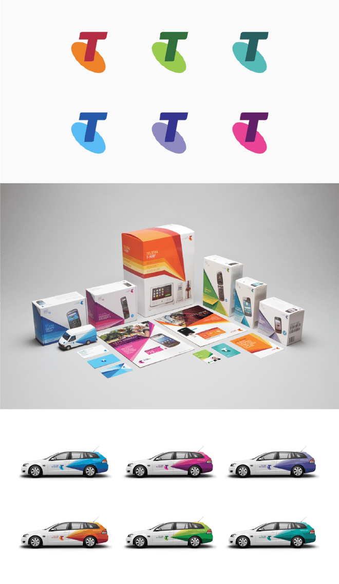
Telstra
Read more here
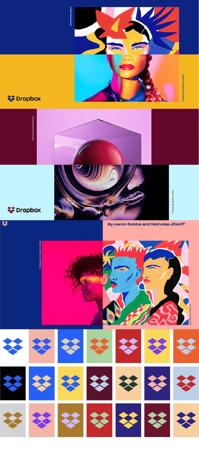
Dropbox
Read more here