What makes a brand? Is it the brand name? Your logo? The colours? Your company philosophy? The product? In truth, it’s all these things, and more: but the logo is a cornerstone upon which all great brands and brand identities are built.
Your logo is an instant visual shorthand way of identifying your brand. Logos tap into the human brain’s ability to process imagery and pattern, and associate memory and emotion - thereby instilling instant meaning into your mark.
An effective logo will not only increase recognition of your brand; it can boost sales.
According to a 2019 study published in the Journal of Marketing Research, descriptive logos that incorporate text or visuals that communicate the product or service your brand offers can increase consumers' willingness to buy your product, particularly if they are unfamiliar with it.
Your logo will appear in more places, on more marketing materials, across more channels, more times than any other part of your brand identity. It’s worth investing the time up front to understand what makes a great logo, and how to design one, so you can be sure yours is just right.
What is a logo and why is it important?
Logos are made up of symbols, shapes and text - or a combination of all three.
The combination of the visual choices made should evoke the brand story of the company or brand it represents, and help you stand out from the competition.
Your logo will often shape the first impression a consumer or prospect forms of your brand. If it communicates that your brand is right for them, then your logo has done its job.
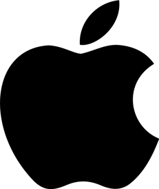
Some logos incorporate a symbol that becomes so well-known it can be used without the brand name; take Apple’s apple logo, with its missing bite, for example; Nike’s tick; or McDonald’s’ golden arches.
What makes a great logo?
There are some key principles to keep in mind when you’re evaluating a new logo design. While it’s not easy to encompass all of them in one simple design, it’s worth keeping them in mind when you’re assessing logo designs or rebrands, to see if your logo ticks the right boxes:
Distinctive and easily recognised
Your logo should stand out from the crowd and instantly denote your brand. If you have to read the fine print to identify the company the logo represents, think again.
McDonald’s’ distinctive ‘M’ is globally synonymous with fast, reliable burgers. We don't even need to pop an example here, we know you're visualising those golden arches right now!
Memorable
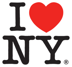
Will your customers be able to recall the logo after they’ve seen it? It’s easy to remember great logos - and what they stand for. What better way to promote a city than the ultra-accessible and memorable I love New York logo?
Reflects your brand identity and message
Is your logo relevant? Does it communicate the right message about your product or service?
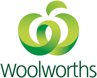
There’s no denying the Woolworths logo, which represents a ‘w’ in the shape of a lush green apple, instantly conveys the supermarket chain’s ‘fresh food’ positioning.
 Timeless
If you’re opting for dots because ‘dots are big this year’, think again: you’ll only have to change your logo when they go out of fashion. Avoid ultra trendy patterns and shapes if you want a logo that will stand the test of time.
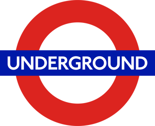
The London Underground’s abstract ‘roundel’ symbolises the subway and the city it represents with two semicircles that form opposing platforms on either side of an intersecting line and has been virtually unchanged since 1913.
 Versatile
Can your logo be applied in all the situations in which you want to apply it? For example, if you want to superimpose it over background images, opt for a bold logo over a finely detailed one.
Apple's distinctive logo can be attached to hardware, backlit in silhouette form, and equally appear in 2D across all manner of marketing materials and channels without diluting its impact.
 Relevant
Does it appeal to your target audience? If your logo doesn’t appeal to the market for which it was intended, it doesn’t really matter how distinctive or beautiful it is.
The Red Cross logo was developed to denote neutral humanitarian aid in times of conflict, but was rejected by some countries, which saw it as a Christian symbol and adopted a red crescent instead. In 2007 a red diamond logo, known as the ‘red crystal’ was added to further distance the organisation from religious connotations.
![]()
How to design a logo
A logo shouldn't be designed in isolation from the rest of your brand identity - rather, it needs to embody your brand - so make sure you have the foundations of your brand to hand when working on your logo design.
Start with your brand identity
If you want your logo to get to the heart of your brand, make sure you have adequately defined all its key attributes. Consider elements such as:
- Brand name: Full name or an abbreviated form?
- Brand story: How did your brand come to be?
- Brand purpose: Your brand's reason for being or mission - beyond making money
- Brand promise: What should your customers expect from an interaction with your brand?
- Brand personality: The human attributes that embody your brand
- Brand values: The factors and philosophy that define how your company behaves
- Brand messaging: What your brand says about itself
- Brand hierarchy: Does your logo need to work with any other logos or brands?
Look for logo ideas and inspiration
Once you've established your brand identity, you can get to work on your logo design. It's important to bring together lots of ideas and inspiration from a broad range of sources to keep it fresh and get the best results.
That said, sometimes you'll simply want to tweak your logo rather than completely redesign it. This is particularly true if your brand is already well-established and your logo is well-known.
Stella Artois has been using virtually the same logo since 1366, restricting changes to tweaks rather than redesigns.
![]() Brainstorm
Brainstorm
Hold a brainstorming session to kick off your logo design process. Invite every interested party, from your CEO to marketing, sales and customer success.
List all the adjectives and symbols you think of, or want customers to use, when they describe your brand.
Be creative. Draw inspiration from:
- Your brand story or company founders
- Relevant symbols, such as the tools of your trade, or mythology
- What you do
- Your target audience
- Your key product benefit
- The emotions your brand invokes
Write down every idea you have, no matter how ridiculous or who suggested it.
Let your ideas percolate. They may spark other thoughts over time.
Narrow them down to your favourites.
Survey your company, partners, customers and the public
It's a great idea to formally survey audiences such as your employees, partners, customers and the public to be sure that your new logo reflects the way your brand is perceived in the market.
Create a mood board
Mood boards are a great way to instantly sum up all the key elements of your brand and clearly communicate your vision for the brand - including the emotional as well as visual elements, and the impact you want your new logo to have.
Consider the competition
It's never a good idea to copy the competition but you may get some inspiration from the things that work well about their logos. Collect all your competitors’ logos in one place so you can check that your new logo design will stand out from the crowd.
Choose your logo design style and type
While the potential combinations are infinite, there are some core aesthetic styles and logo types to keep in mind when designing a logo.
Considering which ones best represent your brand will instantly provide a framework to direct your creative endeavours and help focus your design process.
Logo design styles
The aesthetic style you choose can say a lot about your brand:
- Classic: Focuses on clean lines and a simple colour palette. Conveys and reliability and evokes trust.
- Quirky: Incorporates illustrative and unexpected elements. Conveys youthfulness, freshness and fun.
- Retro: Evokes emotions from times gone by. Indicates history or tradition is important to your brand.
- Minimalist: A modern look with sharp or pared-back lines. Conveys that your brand is up-to-date and contemporary.
- Artisan: Incorporates a handcrafted element. Communicates the importance of craftsmanship to your brand.
Logo types
Do you want your logo to feature your brand name, an image, an emblem, a symbol, or some combination of the above? Consider how some well-known logos represent their brand:
- Letter marks: Otherwise known as monogram logos, these focus on the letters that form the brand name, rather than the full form of the name, and rely heavily on typography to stand out. For example: BBC, NASA and ANZ.
- Word marks: As the name suggests, these feature the full brand name. These work well when your brand name is memorable. Examples are: Coca-Cola, Google and Land Rover.
- Pictorial: Image or symbol-based logos that illustrate the brand name or an icon related to it. For example, Twitter, Shell and Apple.
- Mascot: A caricature that embodies the values of the brand and is used to help tell the brand story. For example, Colonel Sanders (KFC), Coco the Monkey (Coco Pops) and Happy dragon (St George Bank).
- Abstract: Logos that use abstract shapes that encase or represent the brand. For example, ABC, Olympics and BP.
- Emblem: Generally includes a brand name encased in a crest, seal, stamp or badge. Examples: Starbucks, Harley Davidson, and Warner Brothers.
- Combination: One of the most common logo types, combination logos blend a word mark with a symbol, image or shape that represents the brand.
The impact of colour
Colour not only helps your logo stand out from the crowd, it can evoke emotions or tell a story about your brand in an instant. It also increases brand recognition by up to 80%.
When making colour choices, consider the heritage of your brand, your target audience, the cultural meaning of the colours you choose, and how your colours work together.
It’s also good practice to locate all your competitors’ logos on the colour wheel so you can see where the sector is crowded, and what you might need to do to distinguish your brand.
Brand heritage
People can recognise brand colours - consider Ikea - in an instant, so it’s a big step to completely change the colours of your logo. Consider evolving them rather than jettisoning them completely.
Understand the meaning of colours to your target audience
Colours have different meanings depending on the cultural background of the target audience, so it’s worth doing your research to avoid unintended symbolism.
In western culture, we make instant associations with some colours, so consider how your logo leverages - or contradicts - those connections.
- Red - Passion, energy, and power.
- Orange - Vitality, fun, playfulness.
- Yellow - Positivity, youthfulness, creativity.
- Green - Nature, wellness, wealth.
- Blue - Trustworthiness, security, integrity.
- Purple - Sophistication, spirituality, royalty.
- Pink - Femininity, calmness, tenderness.
- Brown - Durability, earthiness, tradition.
- Grey - Scientific, serious, balance.
- Black - Prestige, value, timelessness.
- White - Purity, cleanliness, elegance.
Combining colours
Most top brand logos (95%) use just one or two colours to represent them, according to a study of the world’s top brands, meaning only 5% use three or more colours.
If you are looking to combine colours, consider if you would like to use colours that are:
Complementary: Opposite to each other on the colour wheel, to make both colours pop
Analogous: Next to each other on the colour wheel for a harmonious look
Balanced: Equally spaced around the colour wheel for a bold but balanced look.
Typography
Nine in ten (91%) of the world’s top 100 brands by brand value feature a company name, which makes typography one of the most important choices you’ll make when designing your logo.
Selecting a primary font
There are four main font types to consider:
- Serif: Have little hooks, dots or curls at the ends of each letter to evoke traditional typography. A classic, high-end, vintage look. Aids legibility.
- Sans serif: Letters don’t have the hooks, dots and curls of serif fonts, giving logos a more modern, simpler, clean look.
- Script: As individualistic as the handwriting they attempt to evoke, script fonts can convey a sophisticated image or a casual, quirky brand.
- Display: These fonts are highly stylised
Pairing fonts
When selecting more than one font for your logo, choose the most eye-catching as your primary font, and a complementary font as your secondary typeface. Consider pairing:
- A statement font with a sans-serif or all-caps smaller font
- Different styles or versions of the same typeface.
Design the logo
Whether you go in-house when it comes to designing your logo, you brief an agency, or you pitch it out to freelance designers, be very clear on the requirements for your logo. Consider:
- Previous work from your designer or agency
- The logo design software available to your designer and its capabilities
- The price: A logo can cost anywhere from a couple of thousand dollars to up to $1 million, not including the cost of implementing it across all your marketing channels. Be very clear about the number of versions, revisions and specific channel variations you require for the price.
- Whether you need a secondary mark.
Test it
When evaluating your proposed logo designs, it’s worth putting them in front of some members of their intended audience - both internal and external - and asking:
- Is it memorable?
- Is it appealing?
- What message does it convey?
- Could anyone read something different into the logo or design?
- Does it avoid cliches?
- Does it work in black-and-white and reversed out against a coloured background?
- Does it work with your brand’s full colour palette?
- How does it work within the brand hierarchy or in co-branded situations?
Logo Ideas: 5 of our favourites
Some logos just work, don’t they? We’ve picked a few of our favourite logo ideas and explained the rationale behind them:
Mastercard:
Mastercard has entered the realm of brands for whom their Venn diagram-style logo that symbolises the two hemispheres of the world coming together. It can appear without the brand name and still be recognised globally. The intersecting red and yellow circles, which have evolved but never been replaced, are now so well-recognised they can appear without the ‘Mastercard’ wordmark and have also spawned variations for related brands Maestro and Cirrus in other colours. See their brand style guide here.

Spotify
A combination style logo, Spotify’s concentric lines emanating from its brand neatly pay homage to the radio waves of traditional listening while encompassing the wireless streaming technology by which we consume much of our music today. While the font and style of the logo have changed since it was first created in 2006, the company has continued to use its distinctive
‘Spotify green’ - although the shade has changed, as has its usage within the logo. The company also provides an accessible version of its trademark colours and, while its symbol is reminiscent of the generic ‘wifi’ symbol, it is well on its way to appropriating the waves within the circle to such an extent that there’s little doubt which brand they denote. See their brand style guide here.
![]()
Cadbury
A classic script font wordmark, Cadbury has evolved its logo over time from the signature of its founder, John Cadbury, to a globally known symbol of chocolate for the masses. The gold Cadbury wordmark and signature purple colour evoke the luxury associated with indulgence, while the secondary ‘glass and a half of full cream milk’ mark symbolises quality and generosity. See their brand guide here.
![]()
Qantas
Qantas’s logo has evolved into one of the world’s great airline logos, featuring its white flying kangaroo against a red tailfin background. The Qantas lettermark, originally standing for Queensland and Northern Territory Air Service, has retained its capitalised form over time and adapted the marsupial - added in 1944 to denote its ‘Kangaroo service’ flights that crossed the Indian Ocean - for the dreamliner era with a sleek, streamlined form that denotes suggests flight without wings.
![]()
Logo usage and placement
Once you have chosen your preferred logo design, it’s essential to communicate how it should be used. This means developing clear brand guidelines outlining not only when and how to use your new logo, but how not to use it. It’s worth providing:
- A brand website or page containing your brand style guide
Provide downloadable versions of your logo in a variety of sizes and file formats for use in different channels and specify your exact brand colours.
- Size and spacing
Provide instructions for how to measure the buffer or margin that should appear around your logo and specify a minimum size.
- Correct and incorrect usage guidelines
Show how your logo works in a variety of situations, such as against a busy background, and specify incorrect usage - the less you leave to chance, the better for your brand.
- Logo lock-ups
Particularly if yours is a combination logo, provide it in different configurations and dimensions for a variety of applications
- Grids
Demonstrate how your logo, wordmark, tagline, headlines and other brand elements should go together in different formats, such as brochures and social media channels for a consistent brand presence, and specify the relationship of the logo to the other elements
- Templates
Create templates for all your most commonly used marketing materials to help all users of your logo to maintain brand consistency - better still, enshrine these in a brand automation platform that will ensure your logo and other brand elements always appear correctly.
How Outfit can help
At Outfit, we’ve helped organisations all over the world to put their logo and their brand materials in the hands of their users while protecting the consistency and integrity of their brand.
From logo redesigns to complete rebrands, Outfit’s brand management platform uses responsive templates to enshrine your brand guidelines and ensure dispersed marketing teams and entire organisations can create on-brand marketing materials, every time.
With Outfit, your logo will never be stretched out of shape, your brand colours and fonts will always be correct and your usage guidelines will always be observed, across all marketing channels, regardless of who is producing your brand materials.
This enables your entire organisation to create branded materials quickly, cost-effectively and in-house, reducing repetitive production work and freeing up your teams for high-value strategic work.
Check out our customer success stories to see how we save organisations time and money, enabling them to safely produce more on-brand marketing materials for less.