So why do templates need text restrictions?
Outfit is a great way for enterprises to safeguard the integrity of the visual brand identity but unfortunately, it is no substitute for good copywriting (yet…). However, what we can do is limit the amount of text authors can input so it is within that Goldilocks zone. With a text restriction an author is forced into thinking creatively and strategically to fit their content within the defined text box.
Is the solution a simple Word Count?
No, within Outfit templates text boxes are largely relative and can be of various widths and heights so restricting by an actual word count is unfeasible. There is also the issue of differing letter widths, leading and other typographical variables. 10 is aren’t the same length as 10 ms (unless it’s monospaced).
What is the solution?!
So this is basically what we’re aiming to achieve. A simple textbox that stops content overflowing at a certain point, and once the content goes past that point some visual feedback is applied.
Click the HTML, CSS and JS buttons to see what’s going on under the hood. Once the animation is complete you can also drag the text box out to see how the overflow applies when content no longer fits.
Basic Usage in Outfit
So let’s say we have room for a small body copy paragraph on an advertisement that we’re working on in Outfit. We would use the following HTML and CSS to set up our body copy text box.
1. HTML
From the inside out there is a div with all of our body copy content (this will be used to find the initial content height). That .text div has a parent (.text-box) with a set height (which will be defined in CSS) to create the overflowing area.
<div class="text-box">
  <div class="text">
    Lorem ipsum dolor sit amet, consectetur
    adipiscing elit. Sed et ipsum eget arcu
    mollis  accumsan. Ut convallis pretium ante,
    aliquet accumsan dui aliquet mattis.
    Sed et pretium nulla. Sed arcu dui, fringilla
    ut faucibus ut, suscipit sed nisl.
    Phasellus ullamcorper, ante ipsum dolor sit
    amet, consectetur adipiscing elit.
    Sed et ipsum eget arcu mollis accumsan.
    Ut convallis pretium ante, aliquet accumsan
    dui aliquet mattis. Sed et pretium nulla.
    Sed arcu dui, fringilla ut faucibus ut,
    suscipit sed nisl. Phasellus
    ullamcorper, ante
  </div>
</div>
2. CSS
For the basic setup in our stylesheet all we really need to define is a max-height and an overflow: hidden; on the .text-box.
.text-box {
  width: 100%;
  max-height: 400pt;
  overflow: hidden;
}
So now we get the following, a text-box with content that is correctly overflowing. Hover over the text box to see how much content is still left to display.
And therein lies the problem at hand, with no visual feedback as to where content is overflowing how are they to know? Authors have a limited scope for knowing that their content is running beyond the confines of the text-box.
3. JS
To fix this lack of feedback we can add a little bit of Javascript to make it absolutely clear that there is too much text for the defined text box.
function loop() {
  checkHeight(document.getElementsByClassName('text'));

  /* Add any other text boxes you want to check the overflows on with the following: checkHeight(document.getElementsByClassName('CLASS NAME')); */

} setInterval(loop, 500);

function checkHeight(element) {
  for (i = 0 ; i < element.length ; i++ ) {
    var currentElement = element[i];
    var height         = currentElement.offsetHeight;
    var parent         = currentElement.parentNode;
    var parentHeight   = parent.offsetHeight;

    if (height > parentHeight) {
      parent.classList.add('overflow');
    } else {
      parent.classList.remove('overflow');
    }

    if ((currentElement).parentNode.classList.contains('overflow')) {
      document.body.classList.add('overflow-true');
    } else {
      document.body.classList.remove('overflow-true');
    }
  }
}
To break this down there are two components to this script.
- Firstly we have our
checkHeightfunctionwhich finds the height of a defineddivand then check’s it against the height of its parent. If that height is greater than the parent then we add the classoverflowto theparent. - We then add in a loop of all the
divs we want to run thecheckHeightfunctionon. At the moment I have the loop set to reloading every0.5 sec, it can be set to quicker if there are lesselementsto check, or longer if there are a lot.
Now what do we do with the .overflow?
So when the content overflows correctly the overflow class is added to the .text-box parent. What we can do with this is simply add a set of obvious styles. I’ve found the following styles are sufficient within most templates, long story short though - there is a lot of RED!
.overflow {
  border: 1px dashed red;
  position: relative;
}

.overflow h2,
.overflow p,
.overflow h6,
.overflow li {
  color: red !important;
}

.overflow::before {
  content: '+';
  position: absolute;
  z-index: 5;
  top: 5px;
  right: 5px;
  height: 15px;
  width: 15px;
  border: 1px solid red;
  color: red;
  padding: 2px 2px 2px 3px;
  box-sizing: border-box;
  font-size: 13px;
  text-align: center;
  line-height: 8px;
  background-color: white;
  text-align: center;
}
.overflow:hover:before {
  background-color: red;
  color: white;
}

.overflow:after {
  display: none;
}

.overflow:hover:after {
  display: block;
  content: 'There is overset content in this column. Please remove it';
  position: absolute;
  top: 25px;
  right: 5px;
  background-color: black;
  color: white;
  border-radius: 2px;
  padding: 5px;
  box-sizing: border-box;
  font-size: 11px;
  font-weight: 400;
  line-height: 1.1em;
  text-align: right;
  width: 15em;
}
So this is what a text-box would look like with overflowing content.
Sometimes red is not the best call as it could clash with a brand that has red as a primary colour (like Outfit). In this case we can substitute it with something that is still visually contrasting, like a blue.
Are there any other assurances we can make?
Hey what a great question, there sure are!
At the moment a lot of the focus has been put on the in-editor side of Outfit. We’ve been playing off the assumption that authors realise that their content is overflowing with the current feedback styles and make necessary amendments before exporting the document. However what if they don’t realise? Well we can go one step further to ensure that this advertisement isn’t reaching the public.
While we can’t currently disable the export button when people add in too much content, we can target the results of the exported file to make it incredibly obvious that the content on this export is unacceptable for public viewing.
We do this by targeting the .overflow class on @media print. I use the following CSS:
@media print {
  .overflow {
    background-color: rgba(255, 0, 0, 0.8) !important;
    color: white; !important;
    position: relative;
    border: initial; }
  .overflow:after {
    display: block;
    content: 'There is overset content in this text box. Please remove it';
    position: absolute;
    top: 0em;
    left: 0em;
    right: 0em;
    color: white;
    border-radius: 2px;
    padding: 5px;
    box-sizing: border-box;
    font-size: 0.5em;
    font-weight: 400;
    line-height: 1em;
    text-align: center;
  }
}
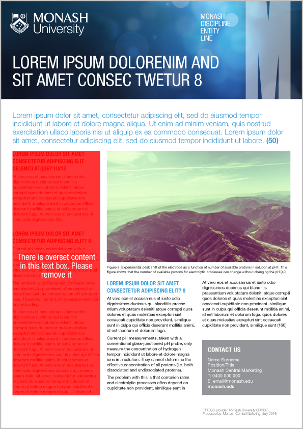
So on export the author would see something similar to the screenshot below. It’s not only glaring obvious that there is an error with the content, but if someone sent that out to market they might have to start looking for a new job.
And that’s about it! Check out my CodePen here (that was shown above) to see an expanded working example. Fork it if you reckon there’s a better way of doing it or if you think the visual feedback could be handled better.
Tweet us at @outfitio if you actually liked the post or found a better way of doing it.