If there are a lot of demands on your marketing, digital and design teams and relatively few human resources to fulfil those demands -- and, let’s face it, not many of us don’t fall into this category -- it’s critical to get your designers and developers working together productively.
One of the best ways to ensure productive collaboration is to create a responsive brand system.
Much like a responsive website, a responsive brand system will ensure your marketing materials remain on-brand and aesthetically pleasing regardless of the format in which they appear, without the need to manually recreate each piece of marketing collateral every time it’s needed for a new channel.
A key foundation of a responsive brand system -- and an underrated design element in general -- is a robust grid.
Grids help you organise information and visual elements to create effective pieces of marketing communication that are brand-consistent, of course, but that also enable you to communicate clearly, speeding up design, recognition and comprehension.
What is a grid?
A grid is like an invisible web or framework that holds a design together, connecting the various elements even when they are separate, and keeping everything in the right place.
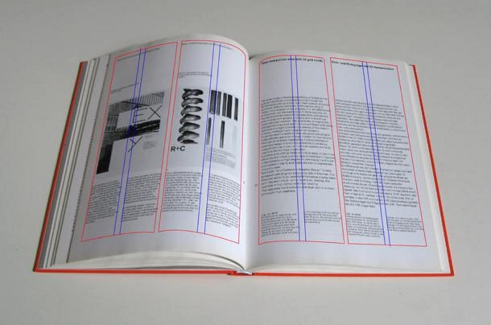
At its most basic, a grid is simply a series of vertical and horizontal or intersecting lines. Think of a book, in which the type appears within margins, making it easier to read.
With a specified grid operating in the background, each new page can be designed quickly and with little effort, presenting information in a uniform way that helps the reader consume it more easily.
While this is where grids began -- think of the illustrated manuscripts that monks once created by hand -- they’ve come a long way since then.
In the digital world, grids provide a framework that speeds up the designer-to-developer workflow by allowing developers to code for precise column sizes, making it easier to translate a design for each new format or channel.
Elements of a grid
The key elements of a robust grid, regardless of the format for which you’re designing, are columns, gutters or alleys, margins, modules and white space.
Format
The format is the space the design inhabits. In a printed book, the format would be the page. For a poster or a digital ad, it’s the dimensions of each poster or ad. For a website, the format is the size of the browser window.
Columns and alleys
A simple grid is made up of two main components: columns and alleys. Columns are the vertical containers in which your information and visual elements appear. These are separated by space referred to as gutters or alleys. Together, they take up the usable horizontal width of the screen.
Margins
Margins are the negative space between the outer edge of the content in which your design appears and the boundary of the format. In a printed book, the margin is the white space between the type and the edge of the page.
Modules
When you introduce an intersecting horizontal line into the mix, you get modules. Modules are individual units of space created from the intersection of columns and rows. They can be used separately or joined to create different sized elements within your format.
White space
Filling every pixel, column-inch or module in your format will make your design harder to comprehend and read. White space is the judicious introduction of negative space in a format that allows the user to see and understand the various other elements.
Benefits of a grid
Grids create a common design framework that enables designers and developers to communicate easily to quickly produce on-brand creative assets incorporating consistent hierarchy, spacing and alignment.
Combining columns, margins, alleys, modules and white space in a grid provides a structure for your responsive brand system that will help you manage the proportions between all the elements in your designs across all the repeatable formats you use.
A robust grid will help your designers and developers
- Establish clearly understood layout principles across formats
- Organise information and visual elements
- Connect every element so they work together as a whole
- Improve brand consistency
- Save time
- Increase clarity, audience recognition and comprehension
- Increase output.
Not only that, but a robust grid system will help make it easier to template and re-use your designs to create new on-brand assets at speed and at scale with a minimum of production resources.
Eventually, this will allow you to create responsive templates that automatically represent key elements in a brand-consistent way, according to your brand guidelines, within a responsive brand system.
In a multi-screen era, designers can’t design with just one format in mind but should think in terms of dynamic grid systems, instead of fixed widths, to create consistent experience across multiple devices.
Types of grids
Here are some key types of grids to keep in mind, and the formats to which they apply:
- Manuscript
A manuscript grid typically has one column within which text and images are placed. Typically used for printed books, they are good for presenting large blocks of text.
- Column
Column grids present information in columns. They work well for formats that feature discontinuous blocks of information, such as newspapers and websites.
For example, many websites are designed using a 12-column grid because it can be divided equally to present information in a variety of ways: 2 x 6 columns, 3 x 4 columns and so on.
- Modular
A modular grid introduces horizontal rows to create a block structure that provides more flexibility than a column grid.
These are often used in mobile design and web design where lots of competing needs to be presented and can be combined to give those elements a hierarchical structure.
- Baseline
A baseline grid provides a structure for the vertical spacing in a design and is used to align different elements horizontally -- like writing on a piece of ruled paper.
Grids in action
It helps to see how different brands apply grids to their design system.
IBM
At the heart of IBM’s design system is its 2x grid. Most things can be divided in two to help organise the required design elements -- such as by dividing space into 2, 4, 8, 16, 32, or 64 columns.
IBM’s brand guidelines contain precise instructions for how to apply grids, gutters and margins, as well as base units to help establish the relationships between your grid proportions, typography, dimensions of shapes, and the space between elements.
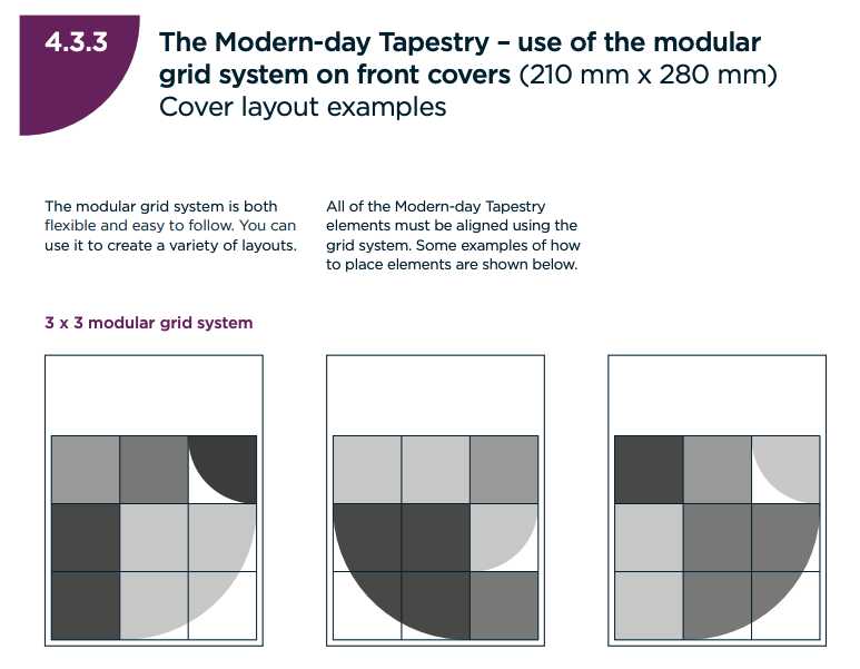
Durham University
Durham University’s brand guidelines specify the use of its ‘Modern-day Tapestry modular grid’ based on a 3:4 horizontal ratio of squares. “The Tapestry is constructed of locking elements within this grid
structure. These elements can be used to hold both photography or colour in multiple combinations,” the brand guidelines state. “For all digital applications use the same modular system which may reduce to 3:3 or 3:2 depending on digital equity.”
Included are examples of how the grid works in different formats, including publications and vertical posters.
Atlassian
Atlassian’s style guidelines specify an 8- or 12-column layout grid for web design, providing the “foundation for harmoniously and consistently positioning elements on screen”.
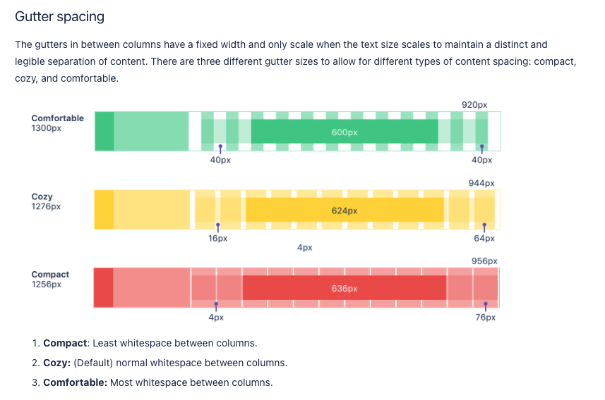
The guidelines detail the use of the baseline grid, gutter spacing, vertical rhythm and best practices.
Tips on using grids to create responsive brand design systems
Finally, there are a few things to keep in mind when using grids to bring order and consistency to your designs and prepare to create a responsive brand design system.
- Consider your constraints -- such as the device types on which your designs will be seen
- Consider both horizontal and vertical spacing
- Align elements using a baseline grid
- Add more emphasis to important objects by presenting them across multiple columns or modular blocks
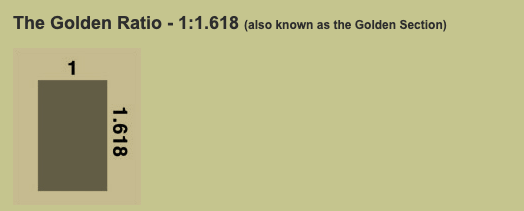
- Keep in mind other design principles, such as the Golden Ratio (dimensions of 1:1.618) that are aesthetically pleasing to the human eye.
- Don’t be afraid to break the grid to add additional emphasis if necessary.
In the digital world, grids help designers to create multiple layouts that support responsive themes for different screen sizes. Applying a robust grid system to your designs will not only save time and keep your designers and developers on the same page, boosting brand consistency, it also provides a foundation for responsive design that can slash your design times from hours and days to just minutes.
Outfit worked with HubSpot to create a join content piece that shows you everything you need to know about developing a brand for your business. Download it today!